A vernacular-first citizen app for India — one front door to government services, organised around life needs instead of departments.
Role
Co-designer
Engagement
Self-initiated product case study
Team
Co-designed with Krishom Sharma
Scope
- Problem framing & competitive teardown
- Information architecture by life need
- Multilingual interface model — four scripts
- Status language & accessibility
- Design system
- Working prototype
Platform
Mobile — working web prototype
Tools
- Figma — UI design
- Framer
Disciplines
- UX strategy
- Product design
- Accessibility
- Design system
Year
2026
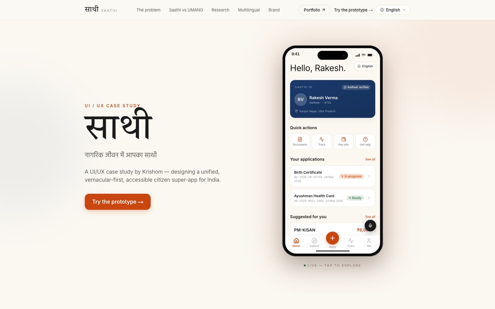
Saathi, co-designed with Krishom Sharma, is a concept for a single citizen app that starts from a person's life rather than from a ministry. It is designed vernacular-first and accessibility-first — four scripts, voice within reach, status written in plain language — and it ships as a working prototype you can use, not a deck you have to take on trust.
A self-initiated product case study, not a commissioned engagement. The product is explored in depth — problem, structure, interface and system — but it has not been launched commercially.
The services exist. The door to them does not.
Government services in India are spread across dozens of separate apps and portals, each with its own login, its own language support and its own forms. The project site lists thirty-six of them, from UMANG and DigiLocker to e-Shram and Passport Seva.
That structure assumes a citizen already knows which department owns their problem — which, for most people, is the hardest part of the task. And a convincing fake portal is often one search result away.
- Services organised by department rather than by need
- A different login and form pattern in every app
- Vernacular support treated as a translation layer
- Status given as reference numbers instead of plain language
Designed for the person least served today.
The primary user reads English as a second language, if at all, and may share one low-cost Android phone with the rest of the household. The prototype's persona, Rakesh Verma from Kanpur Nagar in Uttar Pradesh, is managing a birth certificate, a health card and a farm-support registration at the same time.
The interface therefore has to work in the user's own script, survive a change of user between sessions, and explain where things stand without assuming any knowledge of how government works.
Four scripts, one layout, no new infrastructure.
Saathi is a front door, not a replacement: it is designed to sit on rails India has already built — Aadhaar for identity, DigiLocker for documents, UPI for payments, Bhashini for language — rather than beside them. The integrations are conceptual, and the project states that it is not affiliated with those platforms.
- English, Hindi, Bengali and Tamil in the same layout — each script with different vertical metrics
- Shared, low-cost devices where the language may change between users
- Trust has to be established in the first seconds, against a background of fake portals
- Nothing can be submitted on a person's behalf without their review
Vernacular first, not translated later.
The interface was designed in Devanagari and English together from the first frame, so neither reads as an afterthought. Devanagari needs more vertical room than Latin at the same optical size; designing for it first set the line heights and card proportions, and the other scripts inherited a layout that already had room.
The information architecture was reorganised around life events — a birth, a harvest, a first job, a pension — so a citizen never has to know which department owns a service in order to start it. The mapping from need to department is the product's job.
The decisions that make it usable.
Each of these is visible in the prototype, and each is carried by the design system rather than decided screen by screen.
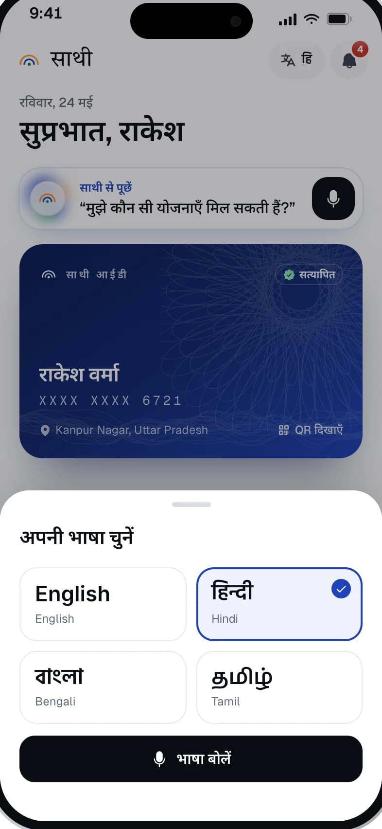
- Language is a first-class header control on every screen, opening a sheet where each language is named in its own script first
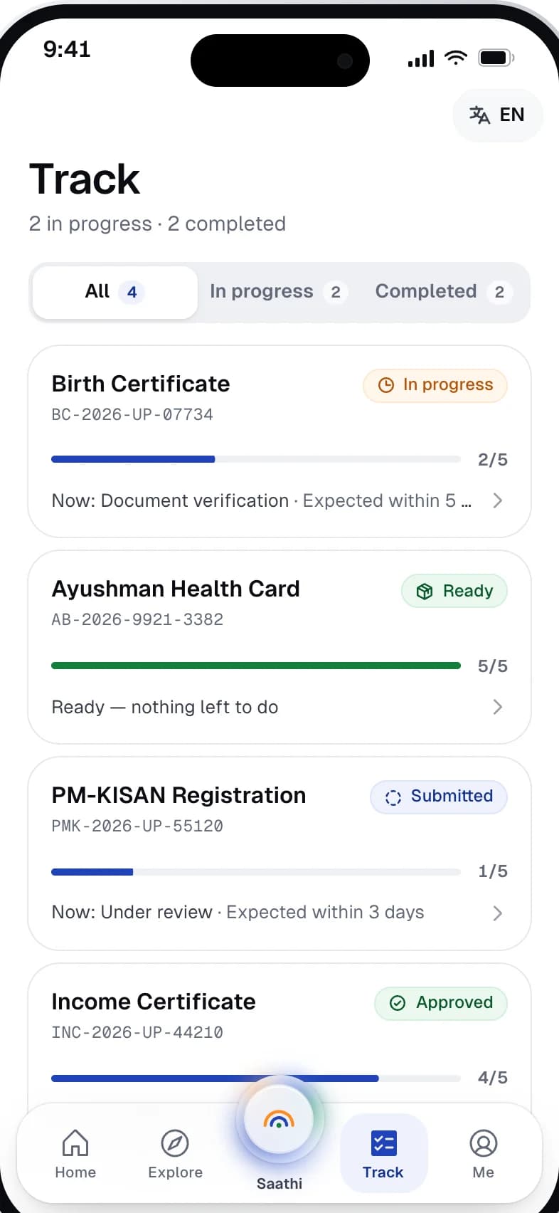
- Status is an icon plus a plain word — In progress, Ready, Submitted, Approved — with the reference number underneath in monospace
- Progress reads as a sentence: “Now: Under review · Expected within 3 days”
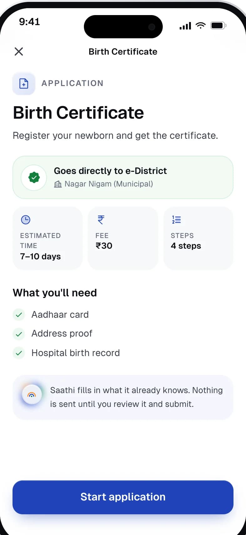
- Before an application starts, the screen states where it goes, the time, the fee, the steps and the documents needed
- The assistant asks before it acts, and the prototype labels itself as a scripted demo with no live AI model
Organised by need, not by ministry.
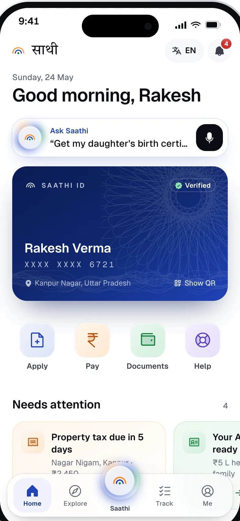
Home leads with identity, then what needs attention, then the four things people come to do: apply, pay, find documents, get help. Five destinations sit in the bottom bar — Home, Explore, Saathi, Track and Me — with the assistant raised in the centre because asking in your own words is the fastest route to any of the others.
A prototype you can use, in four languages.
The working prototype covers onboarding with language choice, home, the assistant, service discovery, application tracking and a full application start for a birth certificate. Switching to Hindi, Bengali or Tamil changes every string and keeps every layout.
What the work clarified.
Designing for a second language changes the layout, not just the strings. Committing to Devanagari first forced decisions about density and rhythm that would have been painful to retrofit.
It also clarified how much of accessibility is editorial rather than technical — the words on a status pill matter as much as its contrast. The next step would be testing those words with the people they are written for; the header's 36px icon buttons are also below the 44px touch-target guideline and would be the first thing to fix.
Built from one system.
Saathi's system is built for legibility across scripts and for trust. A calm neutral ground, one blue for action, and status colours that always travel with an icon and a word — so the interface still reads correctly for someone who cannot rely on colour, or on English.
Every value here was read from the live prototype's computed styles — colours, typefaces, sizes, radii and touch-target dimensions — and the screens below are captures of that prototype.
01 — Foundations
Colour, type and shape — the decisions every component inherits.
Action
Blue
#1F43B8
Primary actions, links, selection
Deep Blue
#16338F
Active navigation label, ID card
Blue Tint
#EEF2FC
Selected and active surfaces
Saffron
#FF8A1F
Brand mark
Surfaces & text
Ink
#0B0D14
Headings, voice buttons
Body
#3A3F4B
Body copy and labels
Muted
#626978
Secondary text, reference numbers
Canvas
#F7F8FA
App background
Hairline
#E6E8EE
Borders and dividers
Status
Success
#12803C
Ready, approved, complete progress
Success Tint
#ECF8F0
Ready and verified surfaces
Warning
#B45309
In progress, payments due
Warning Tint
#FFF6EC
In-progress surfaces
Violet
#5B3FC4
Help action
Typography
Interface · Latin
Geist
Good morning, Rakesh
Interface · Devanagari
Noto Sans Devanagari
सुप्रभात, राकेश · अपनी भाषा चुनें
Bengali and Tamil render in their Noto counterparts, inside the same layout.
Reference numbers · Latin
Geist Mono
PMK-2026-UP-55120
Monospace so a reference can be read back character by character over the phone.
Display · Devanagari
Tiro Devanagari Hindi
हर सरकारी सेवा का एक द्वार।
Used for the Hindi display line on the project site.
Type scale
Corner radius
- PillChips, status, language999 px
- Navigation bar26 px
- ID card24 px
- CardsTracker and attention cards22 px
- Action tile18 px
Touch targets
- Navigation item70 × 70 px
- Quick action82 × 96 px
- Voice button44 × 44 px
- Header controlsBelow the 44 px guideline — a known gap36 × 36 px
02 — Components
Rebuilt from the Saathi screens and tokens — the parts every screen is assembled from.
अपनी भाषा चुनें
Language picker
Each language named in its own script first, English second. Selection is a border, a tint and a check — never colour alone — and voice sits right under the choice.
Status pill
Four states, each an icon and a plain word. Colour reinforces the state; it is never the only signal.
PMK-2026-UP-55120
Now: Under review · Expected within 3 days
AB-2026-9921-3382
Ready — nothing left to do
Application tracker
The plain-language step leads; the reference number follows in monospace. Progress is shown as a bar and as a count.
Voice button · 44 × 44 px
Ask Saathi
The assistant is introduced as an example question in the user's own language, with the voice button at the thumb's end of the bar.
Tile 82 × 96 px · icon well 56 × 56 px
Quick actions
Four things people come to do, not four departments. Each keeps its own hue so it can be found again by icon and colour together.
Filter tabs
Counts sit inside the tabs, so how much is still pending is visible before tapping.
Each target 70 × 70 px · active state is a tinted surface plus weight, not colour alone
Bottom navigation
Five destinations with the assistant raised in the centre. Generous 70px targets for a shared, low-cost phone.
Header controls 36 px · primary action full width
Header controls & primary action
The language switch lives in the header on every screen, because on a shared phone the language can change between one user and the next.
03 — Patterns
How the components combine into behaviour that repeats across the product.
Status in words, reference underneath
Every application reads the same way: title, status pill, reference number, progress, and one sentence saying what is happening now and when to expect it. A citizen never has to decode a reference to know where they stand.
PMK-2026-UP-55120
Now: Under review · Expected within 3 days
AB-2026-9921-3382
Ready — nothing left to do
Language is always one tap away
The header chip shows the current language and opens a sheet on every screen. Switching changes the strings and keeps the layout — the Hindi home screen has the same structure as the English one.
अपनी भाषा चुनें
Know before you start
Before the first form field, the birth-certificate application states where it goes (e-District, via the municipal body), the estimated time, the fee, the number of steps and the documents needed — so nobody abandons halfway for want of an Aadhaar card.
Consent before action
Saathi fills in what it already knows, but nothing is sent until the person has reviewed it and submitted. The assistant says it asks before it acts, and the prototype openly labels itself a scripted demo with no live AI model.
Organised by life need
Quick actions and the assistant's suggestions are phrased as tasks from a person's life — get my daughter's birth certificate, pay my property tax, where is my Ayushman card — not as the names of the schemes that deliver them.
Tile 82 × 96 px · icon well 56 × 56 px
04 — Applied system
The same foundations and components carried across real screens — none of them designed in isolation.