A fitness dashboard that brings data from separate devices into one view — built as a module system that ships in dark and light themes.
Role
Product Designer
Engagement
Self-initiated product case study
Scope
- Research & user persona
- User flow & information architecture
- Wireframes
- Data visualisation — one chart grammar
- Design system with dark and light themes
- High-fidelity UI
Platform
Tablet & desktop dashboard
Timeline
5 weeks
Tools
- Figma — UI design
Disciplines
- Product design
- Data visualisation
- Design system
Year
2025
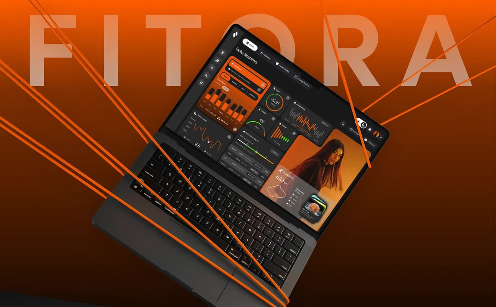
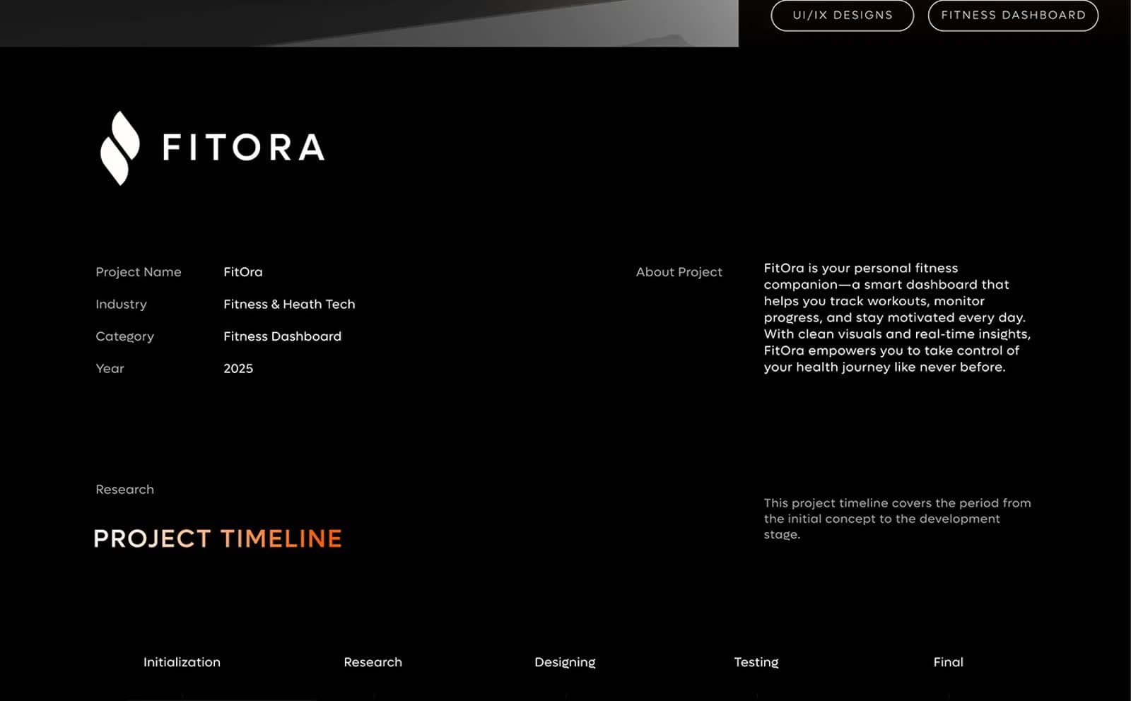
FitOra is a self-initiated product case study built around a problem the research put plainly: people struggle to sync fitness data across devices and platforms, so their progress lives in several places and is hard to see as one. FitOra is the one place — a dashboard where activity, heart rate, stress, water, calories and sleep share a single visual language, in a dark and a light theme.
A self-initiated product case study, not a commissioned engagement. The product is explored in depth — problem, structure, interface and system — but it has not been launched commercially.
Fitness data lives in too many places.
People who train seriously collect data from watches, phones and apps that do not talk to each other. Syncing it is unreliable, and without one place to see it, progress is hard to read — which makes it hard to stay motivated.
Someone who treats fitness as a lifestyle.
The persona, Zoe, is 28, based in Texas, and a fitness enthusiast and blogger. For her, staying fit is part of daily life, and what she wants is a simple, reliable tool that brings all her fitness data into one place so she can track progress and stay motivated.
Her needs ranked personalisation first, then quality content, then an easy interface. Her goals: track and visualise daily progress simply, stay consistent through reminders, and sync data from multiple devices.
Three reading distances on one surface.
A fitness dashboard is asked three unrelated questions: am I on track today, how was this week, and am I actually improving. They need different amounts of attention, but they have to share one screen without the answers competing.
- Many metrics — steps, heart rate, stress, water, calories, sleep, runs — with no single hero number
- A layout that can absorb another data source without redesigning the page
- Two themes that must feel like the same product
Wireframe the modules, then design the grammar.
The project ran over five weeks: research and user analysis in the first, UX, wireframing and prototyping in the second, UI and the design system in the third, user testing in the fourth, and improvements and the case study in the fifth.
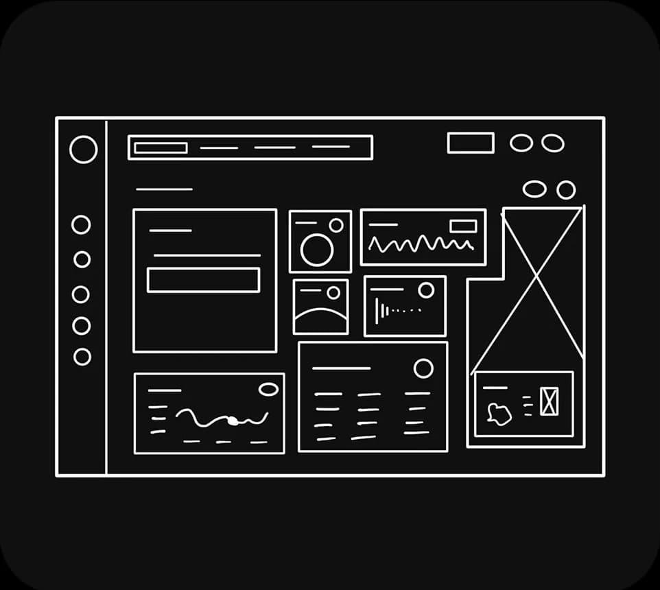
The wireframe established the idea that carries the whole product — the dashboard as a grid of self-contained modules rather than a page. Visual design then gave every module the same anatomy and every chart the same colour logic.
The decisions behind the dashboard.
All of these are visible in both themes, which is the clearest evidence that they are system rules rather than one-off choices.
- Modules, not a page: every metric is a card with the same header — icon, title, one action
- Orange carries measured data — the steps ring, heart-rate bars, water level — in both themes
- Timescale is a control inside the module — Week, Month, Year, Lifetime — not a separate page
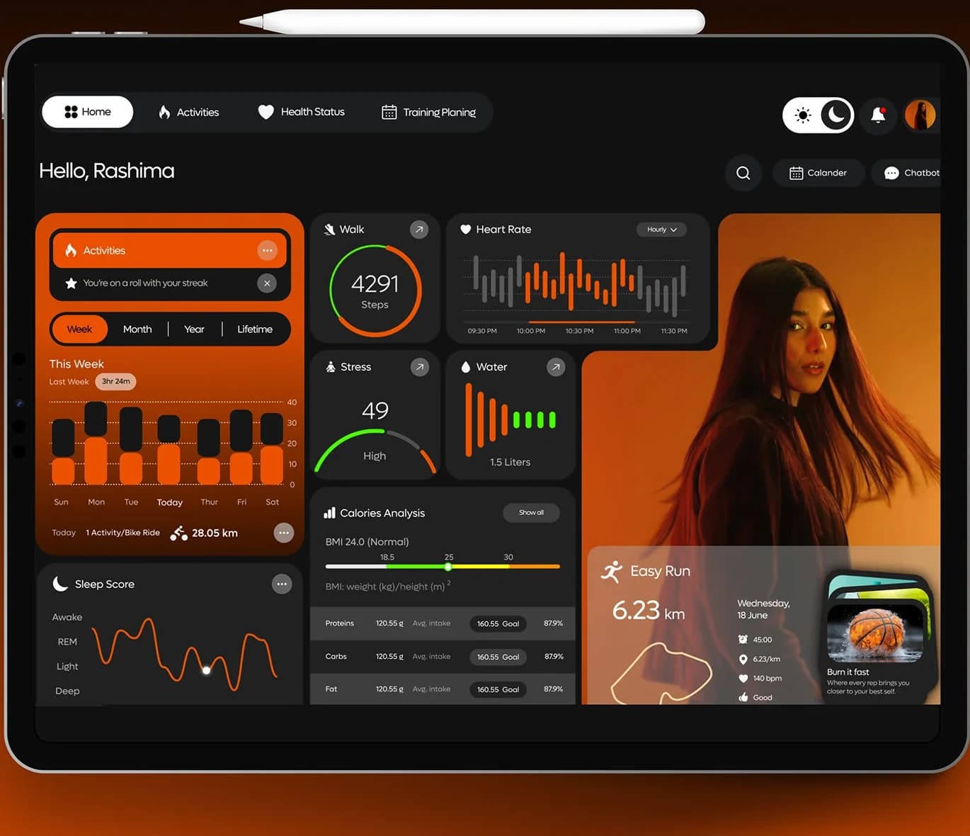
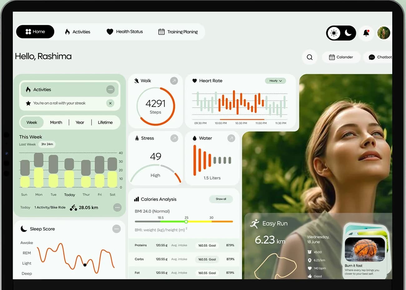
- In dark mode the primary activity module is the one orange-filled surface; light mode moves that emphasis to pastel green and keeps orange for the data
- Four top-level sections — Home, Activities, Health Status, Training Planning — with search, calendar and a chatbot in the header
A dashboard at the centre of the flow.
The user flow runs from login and onboarding into the dashboard, which opens onto the main modules — activities, sleep, steps, stress, calories, heart rate, water and run progress. Calendar integration, the chatbot, notifications, goals and the theme toggle sit alongside as supporting features, with profile, statistics and account management behind them.
One dashboard, two themes.
The final dashboard greets the user by name and lays out activity with a weekly chart, a steps ring, heart rate by the hour, a stress gauge, water intake, a calorie and BMI breakdown, sleep score, and the latest run over a full-bleed photograph. The light theme uses exactly the same modules and layout.
What the work clarified.
Designing the second theme was the real test of the system. Because every module already shared its anatomy and colour logic, light mode was a change of tokens rather than a redesign.
The dashboard is designed at tablet and desktop sizes. The next step would be proving the module system on a phone, where the grid becomes a scroll and the chart grammar has to hold at half the width.
Built from one system.
FitOra's system is warm and physical rather than clinical: a near-black or pale-green ground, one orange for measured data, and a module anatomy repeated for every metric. The same palette produces both themes.
Palette and typeface are from the published FitOra style guide. The lime used in light mode is sampled from the screens and is not part of the published palette. Components are rebuilt from the published dark and light dashboards; spacing and radius values were not published and are not guessed at.
01 — Foundations
Colour, type and shape — the decisions every component inherits.
Published palette
Charcoal Black
#171717
Dark canvas, text in the light theme
Iron Gray
#252525
Module surfaces in the dark theme
Pastel Green
#CAE1CE
Primary module in the light theme
Icy Green
#E9F0EC
Canvas and cards in the light theme
Orange
#FF5400
Measured data and active controls
Sampled from the screens
Lime
#ECFF8E
Weekly activity bars, light theme only
Typography
Interface & figures
Lufga
Hello, Rashima — 4291 steps
Lufga is a licensed typeface and isn't redistributed on this site — this specimen is set in a stand-in.
02 — Components
Rebuilt from the FitOra screens and tokens — the parts every screen is assembled from.
Module card
The anatomy every metric shares: icon and title, one control, one visual. Consistent enough that the grid can be rearranged without redesigning a card.
Progress ring
A single figure against a neutral track, with the orange arc showing progress.
Gauge
The same figure-in-the-middle layout as the ring, stretched to a half-arc for ranged measures like stress.
This Week
Weekly activity
Stacked bars per day, with today marked by weight in the axis rather than by a second colour.
Timescale control
Week, Month, Year and Lifetime switch a module in place, with the active option in orange.
Theme toggle — dark active · light active
Navigation & theme toggle
Four sections in a pill, with the active one in white. The theme toggle is a first-class control in the header, not a setting.
Dark
Light
One module, two themes
The same module drawn with the dark and the light tokens. Orange stays constant; surfaces and text swap.
03 — Patterns
How the components combine into behaviour that repeats across the product.
Module anatomy
Every metric — walk, heart rate, stress, water, calories, sleep — is a card with the same header and one visual. It is what lets the dashboard carry a dozen figures without any one of them needing to shout.
One chart grammar
Rings, gauges and bars share a neutral track and an orange measure, and a figure always sits at the centre or top of its chart. Learn to read one module and you can read all of them.
Themes as a token swap
Dark and light are not two designs. The modules, the layout and the orange data colour are identical; only the surfaces, text and the primary module's fill change.
Dark
Light
Time as a control
Rather than separate daily, weekly and monthly pages, a timescale control inside the activity module changes what it shows — so the question changes without the user losing their place.
04 — Applied system
The same foundations and components carried across real screens — none of them designed in isolation.