Chandigarh's original foot spa since 2018 — handcrafted rituals and salon services across five outlets.
Role
Web design & build
Engagement
Client project — live
Scope
- Art direction & visual system
- Multi-outlet information architecture
- Treatment and pricing pages
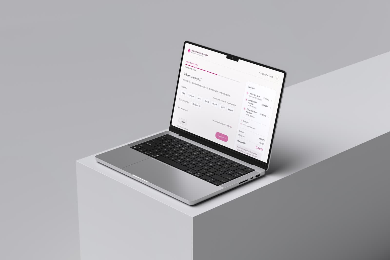
- Booking flow
- Responsive build
Tools
- Figma — UI design
- WordPress
Disciplines
- Web design
- Art direction
- Brand experience
A booking-led site for a wellness brand operating five outlets in Chandigarh. The design had to carry a genuine sense of rest while still making it obvious how to book, which outlet is nearest, and what a treatment actually involves — three practical questions the calm must not get in the way of.
Five outlets, one brand, one decision.
A returning customer arrives knowing exactly which treatment they want and needs the nearest outlet and a time. A first-time visitor arrives knowing only that their feet hurt, and needs to understand what is on offer before they will commit to anything.
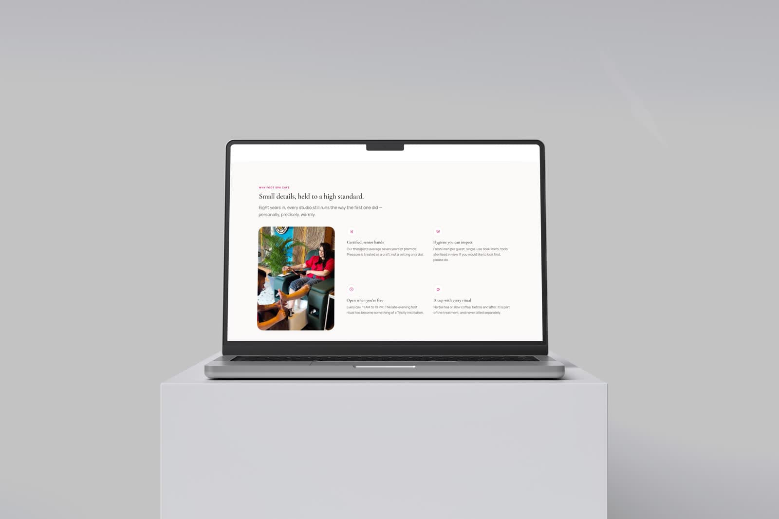
The structure serves both without splitting into two sites: treatments lead, outlets and booking follow immediately, and neither audience is made to scroll past the other's content.
Calm is the product, but calm does not convert on its own.
Wellness brands routinely over-index on atmosphere — soft imagery, generous space, low contrast — and end up with sites that feel lovely and book nobody. The tension was to keep the restfulness while holding a decisive, high-contrast path to booking at all times.
Soft surface, decisive actions.
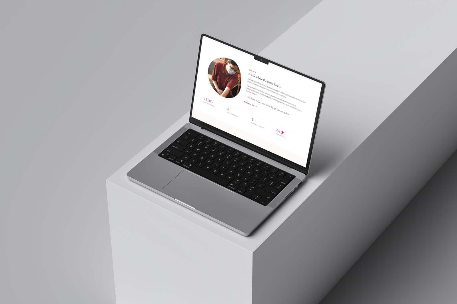
Warm neutrals and generous imagery set the tone across the page. Against that, the booking action stays at full contrast and remains reachable at every scroll position, so the visual calm never becomes an obstacle.
Treatments are described in plain language with duration and price stated up front. In this category, hiding the price is read as a warning sign rather than as sophistication.
- Booking reachable from any scroll position
- Duration and price stated on every treatment
- Outlets presented as a simple choice, not a directory
What the work clarified.
The single biggest improvement was stating prices plainly. Every softening of that — 'from', 'starting at', 'enquire' — made the brand feel less trustworthy, not more premium.
The visual system.
A wellness brand in two registers: Cormorant Garamond for a soft, unhurried voice, Manrope for clear information, one magenta for every booking action, and plum for depth — the palette of a candlelit treatment room rather than a clinic.
Colour names and values are the design tokens declared in the live site's CSS; type sizes, weights and button styles were measured from the rendered page at desktop width.
01 — Foundations
Colour, type and shape — the decisions every component inherits.
Brand
magenta
#C3096F
Booking actions, prices
magenta-deep
#9C0658
Pressed states
plum
#5A224B
Labels, dark bands
plum-deep
#3D1533
Deepest bands
rose
#D98AA8
Soft accents
Neutrals
cream
#FCFAF8
Page
sand
#F7EFF3
Tinted surfaces
hairline
#EADFE4
Borders
muted
#6B5B65
Secondary text
ink
#241A21
Headings and body
Status
positive
#1F7A5C
Confirmations
caution
#A86A00
Notices
critical
#B4243A
Errors
Typography
Display
Cormorant Garamond
Walk in. Float out.
Text & labels
Manrope
Handcrafted foot rituals, deep-rest massage.
Type scale
Corner radius
- Buttons999 px
- Panels28 px
- Cards20 px
- Inputs12 px
02 — Components
Rebuilt from the Foot Spa Cafe & Salon screens and tokens — the parts every screen is assembled from.
Foot Spa Cafe & Salon
Walk in. Float out.
Handcrafted foot rituals and deep-rest massage, across five studios.
Type in use
Display and text faces as they appear on the site, on its own ground.
Buttons
Primary and secondary actions as styled on the site.