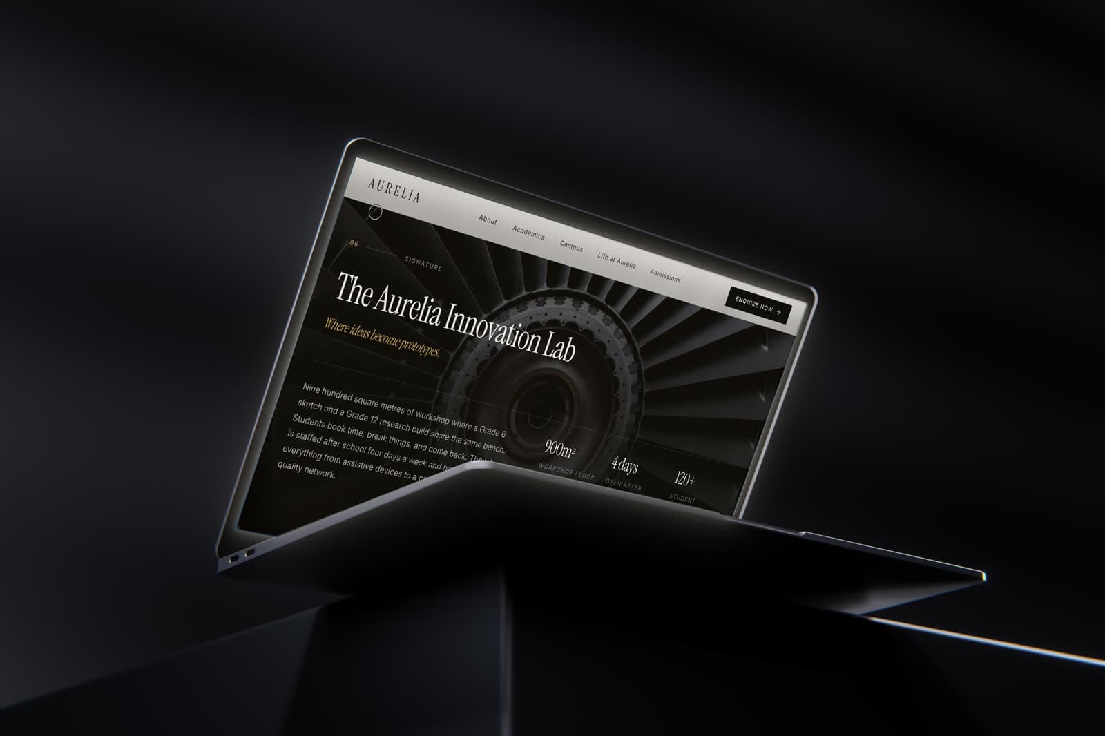
A modern K–12 institution focused on academic excellence, innovation, character and global citizenship.
Role
Web design & build
Engagement
Self-initiated concept
Scope
- Editorial art direction
- Prospectus-style page structure
- Admissions & campus visit paths
- Responsive build
Tools
- Figma — UI design
- Framer
Disciplines
- Web design
- Art direction
- Content strategy
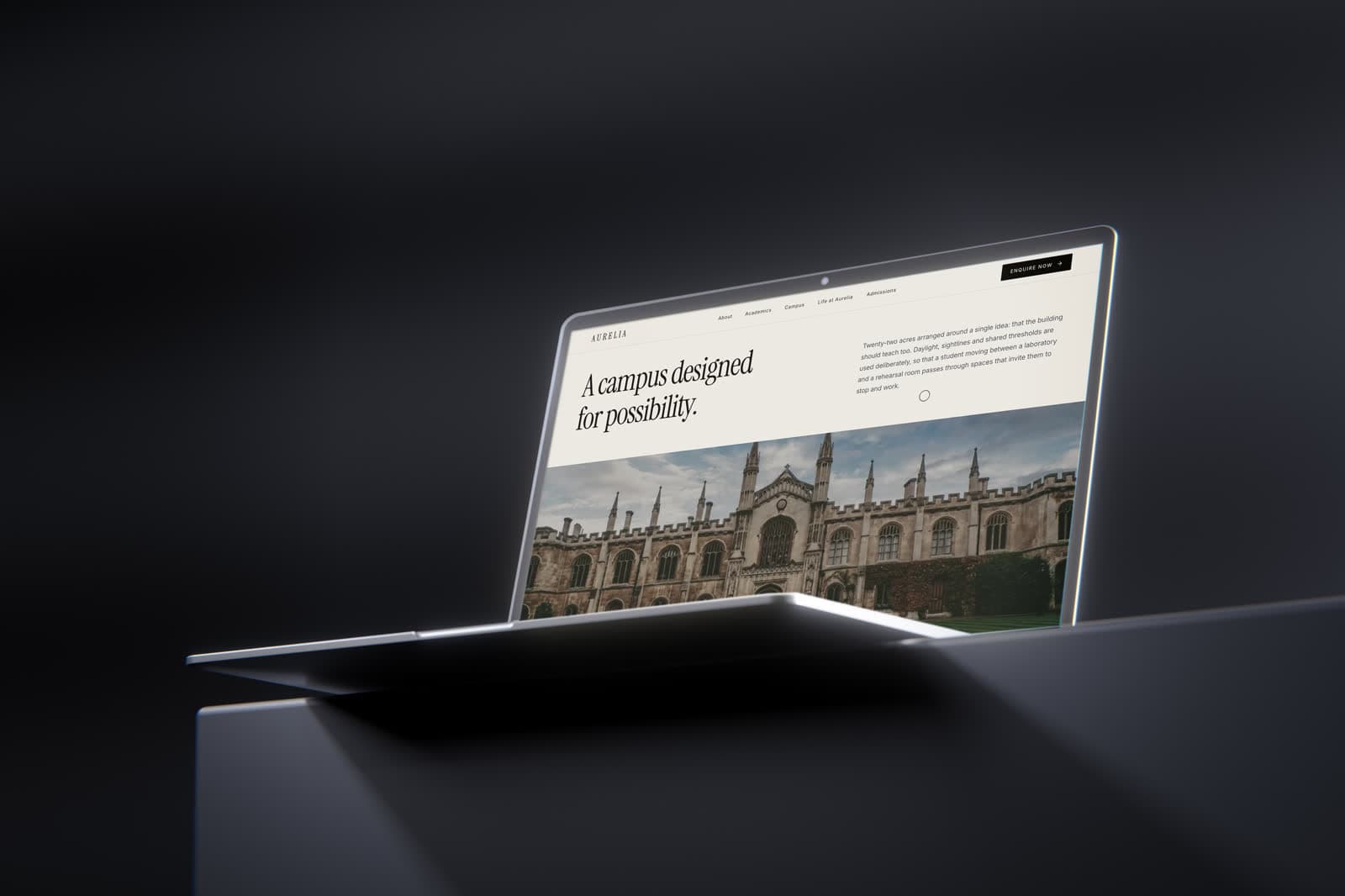
Aurelia is positioned as a school for the world ahead. The site is composed like a printed prospectus — one strong opening statement, then the evidence for it — with admissions and a campus visit always within reach of wherever a reader has got to.
A self-initiated concept. The business is real; the engagement is not — this was designed to explore the brief, not delivered to a client.
An institution presented as an environment.
Philosophy and campus lead the page; curriculum detail, policies and process sit behind a clear second layer so they never compete with the narrative a prospective family came to read.
The order is deliberate: a school is chosen on a feeling and justified afterwards with facts, and the site is built to supply both in that sequence.
Editorial pacing, administrative depth.
Large photography, a small number of strong statements per screen, and a great deal of whitespace give the institution the confidence of a printed prospectus rather than the density of a portal.
Underneath, the depth is complete — programmes, faculty, facilities and process are all there for the parent who wants to read everything before they enquire.
- One idea per screen at the front of the site
- Full administrative depth kept one layer down
- A persistent path to admissions and a campus visit
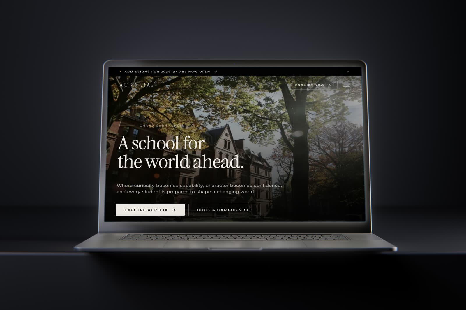
The visual system.
An editorial system: an obsidian and ivory ground, sage and brass as quiet accents, very large Instrument Serif headlines over small tracked Inter labels, and 2px corners.
Colour names and values are the design tokens declared in the live site's CSS; type sizes, weights and button styles were measured from the rendered page at desktop width.
01 — Foundations
Colour, type and shape — the decisions every component inherits.
Ground
obsidian
#0B0D0F
Dark hero and bands
ink
#17191C
Headings on light
ivory
#F6F4EF
Page, text on dark
ivory-warm
#FBFAF7
Raised surfaces
bone
#E8E6E1
Section bands
Accent
sage
#607568
Secondary accents
sage-deep
#4A5C51
Pressed and dark accents
brass
#C8A96B
Highlights
muted
#5E6367
Body text
Typography
Display
Instrument Serif
A school for the world ahead.
Text & labels
Inter
Where curiosity becomes capability.
Type scale
Corner radius
- Buttons2 px
- Pills999 px
02 — Components
Rebuilt from the Aurelia Global School screens and tokens — the parts every screen is assembled from.
Admissions for 2026–27 are now open
A school for the world ahead.
Where curiosity becomes capability, and character leads.
Type in use
Display and text faces at their measured weights and tracking, on the site's own ground.
Buttons
Primary and secondary actions exactly as styled on the live site.