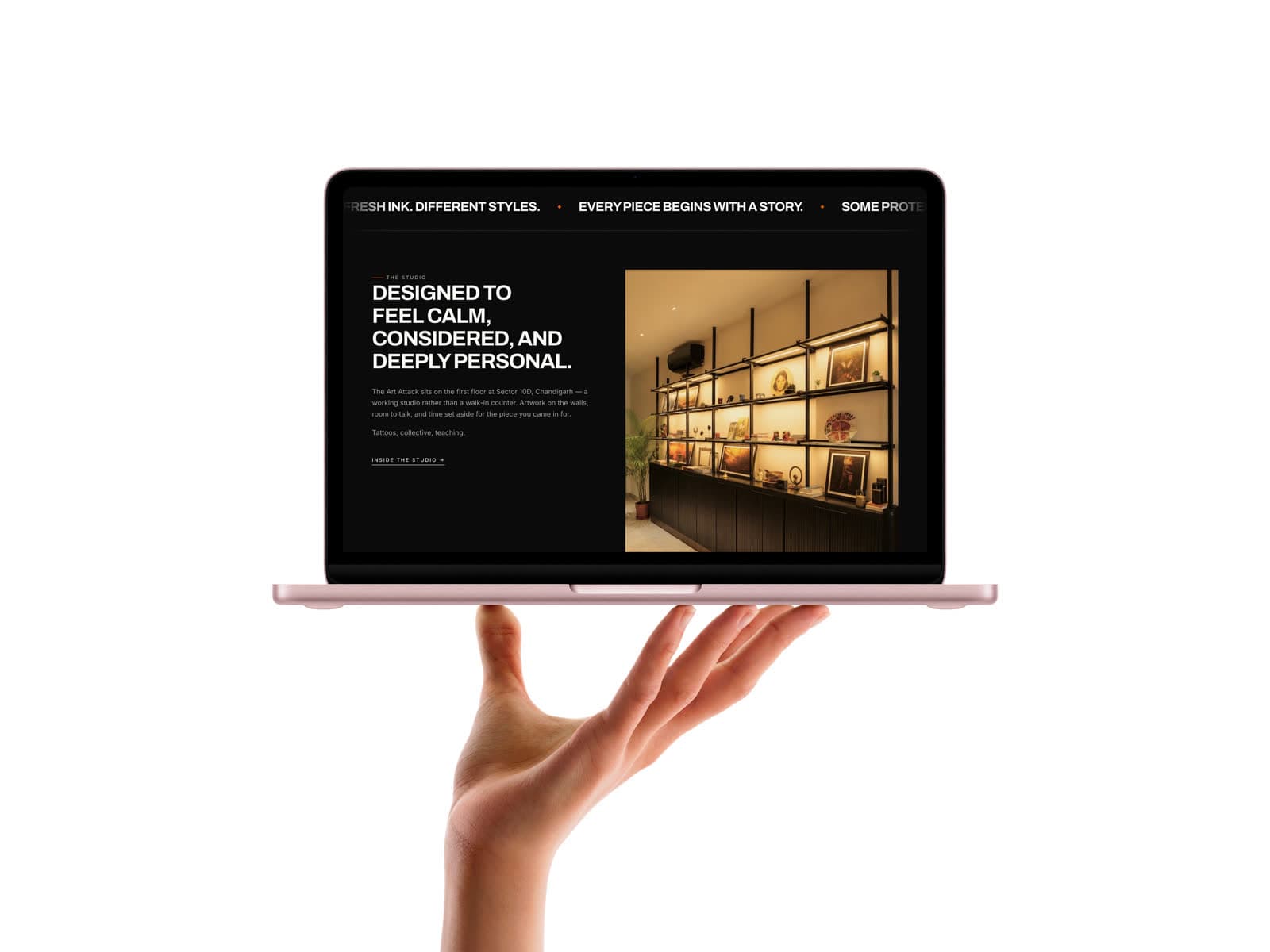
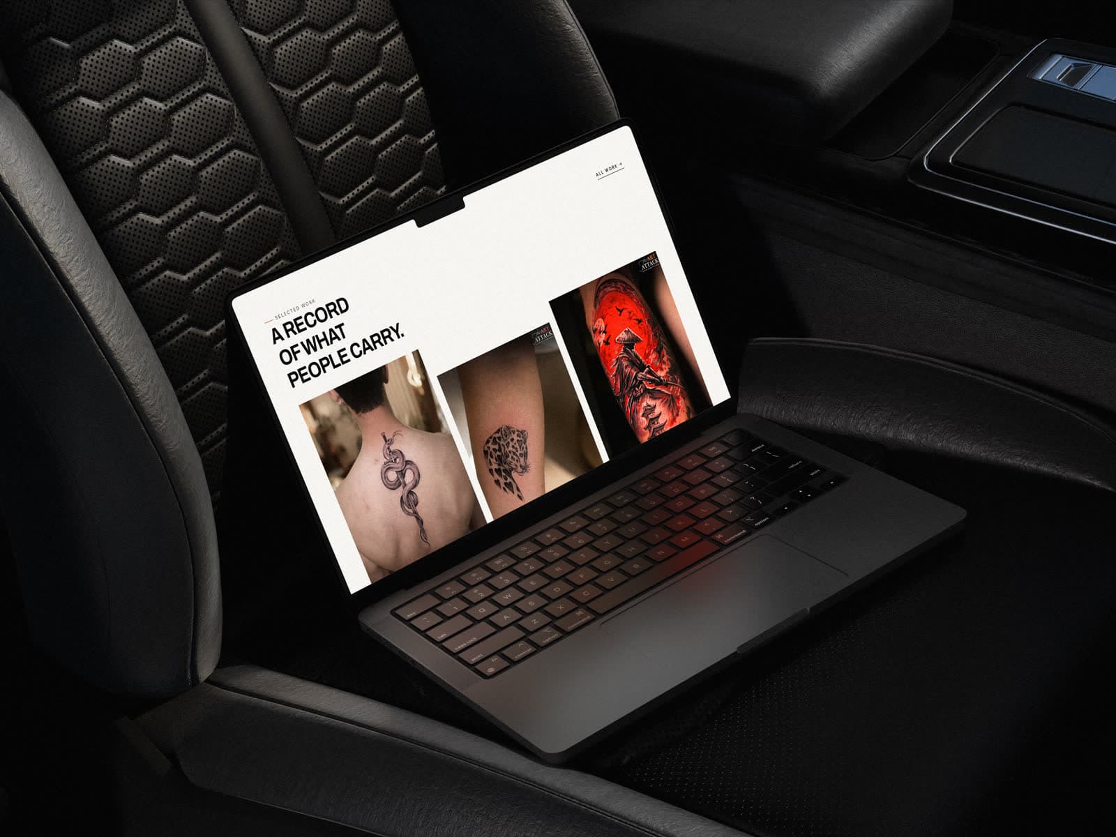
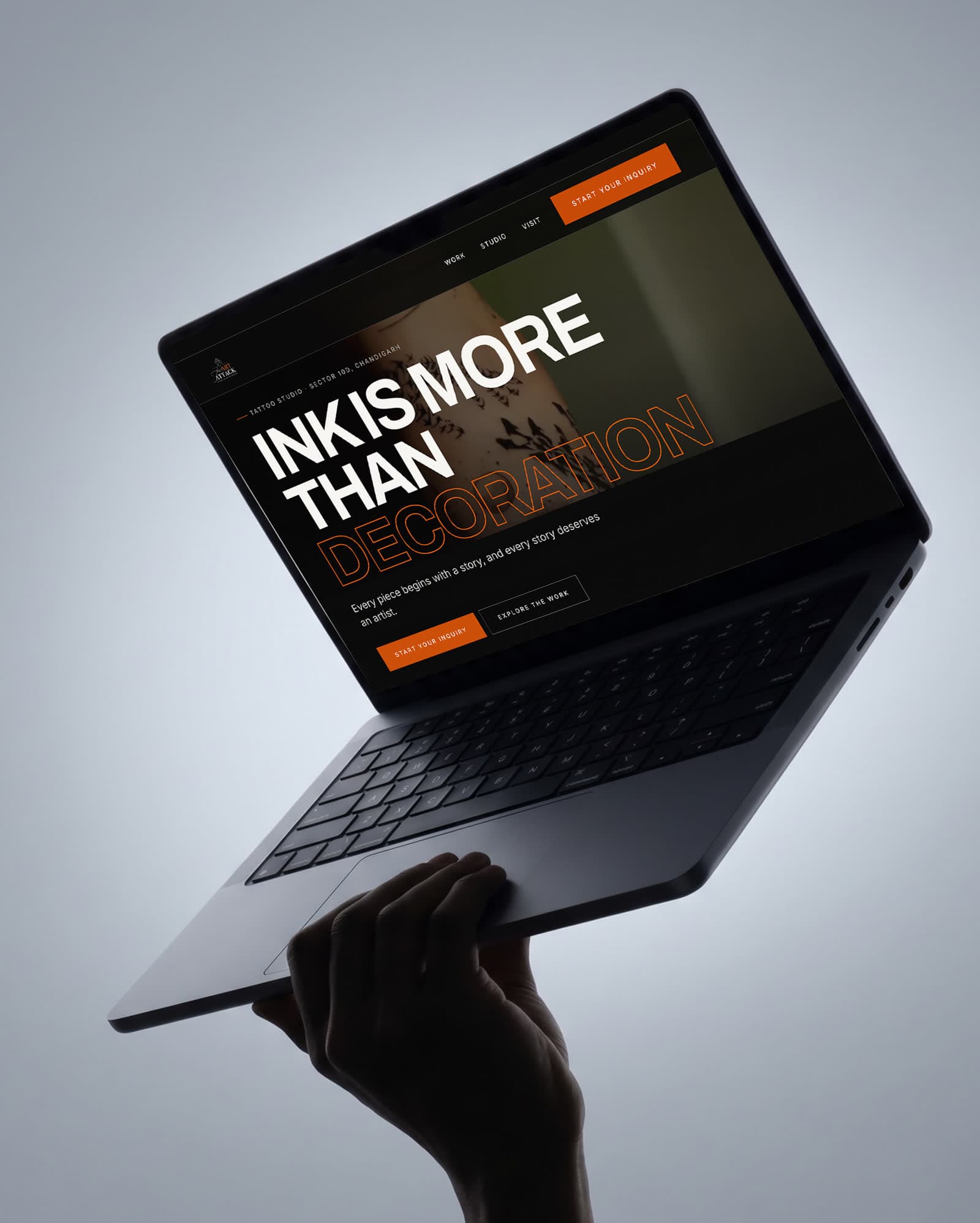
A tattoo studio in Sector 10D, Chandigarh, for people who believe ink is more than decoration.
Role
Web design & build
Engagement
Self-initiated concept
Scope
- Brand-led art direction
- Portfolio gallery system
- Artist profiles
- Consultation enquiry flow
Tools
- Figma — UI design
- Framer
Disciplines
- Web design
- Art direction
- Brand experience
A studio site where the portfolio is the product. Everything the design does is in service of showing the work accurately and then making a consultation the obvious next move — because a tattoo is chosen by looking, not by reading.
A self-initiated concept. The business is real; the engagement is not — this was designed to explore the brief, not delivered to a client.
The work does the selling.
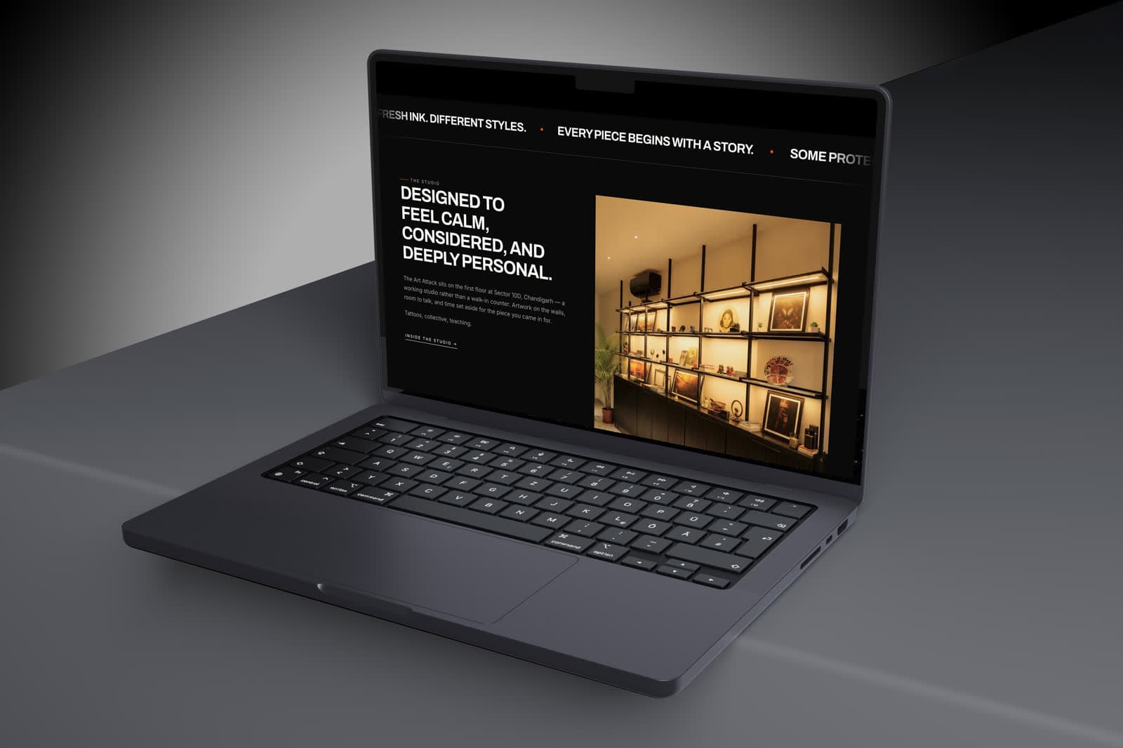
Gallery, artists, styles and booking. Everything else was cut, because in this category a visitor is evaluating line quality and shading, and every element that is not the work is competing with it.
High contrast, heavy type, dark ground.
A near-black surface lets skin tones and ink read accurately — which matters more here than any brand colour, since a client is judging whether the studio can execute the thing they want on their own skin.
Type is set heavy and tight to match how the studio actually speaks. The voice is direct and slightly confrontational, and a polite typographic system would have undercut it.
- Dark ground chosen for colour accuracy, not for mood
- Gallery crops that never distort a piece
- Consultation framed as a conversation, not a checkout
The visual system.
High contrast by design: near-black and paper, a single orange reserved for the enquiry action, heavy uppercase Archivo headlines, and no rounded corners anywhere.
Colour names and values are the design tokens declared in the live site's CSS; type sizes, weights and button styles were measured from the rendered page at desktop width.
01 — Foundations
Colour, type and shape — the decisions every component inherits.
Ink & paper
ink
#0A0A0A
Dark ground
paper
#F7F6F2
Light ground, text on dark
ink-muted
#6B6A66
Body on light
paper-muted
#A3A19C
Body on dark
Accent
accent
#E2560A
Highlights
accent-button
#C94A08
Enquiry buttons
accent-deep
#B8420A
Pressed
accent-quiet
#CC3E0E
Secondary accents
Typography
Display
Archivo
INK IS MORE THAN DECORATION
Text & labels
Inter
Every piece begins with a story.
Type scale
Corner radius
- EverythingSquare corners are part of the voice0 px
02 — Components
Rebuilt from the The Art Attack Tattoo Studio screens and tokens — the parts every screen is assembled from.
Sector 10D · Chandigarh
Ink is more than decoration
Every piece begins with a story, and every story deserves care.
Type in use
Display and text faces at their measured weights and tracking, on the site's own ground.
Buttons
Primary and secondary actions exactly as styled on the live site.